I filmed this from the cab of my truck this afternoon, just thinking out loud about trade shows. If your business ever sets up a booth at one, this is for you.
The short version: that live, face-to-face time on the show floor is the most expensive and most valuable thing you do all year. When someone walks past your booth, do they know who you are and what you do?
I did this for years, and it worked. If your booth isn't pulling its weight, that is part of what I do now.
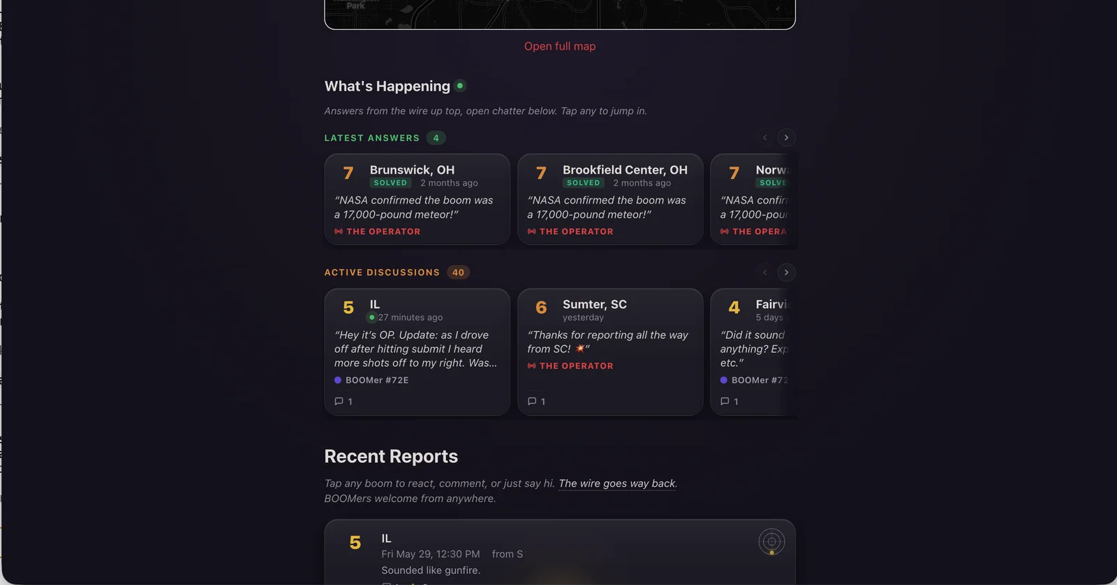
BOOM?, the Rendered Digital community app I built for the Metro East, has a new home-page panel that reads the room. Quiet hour? It says "Quiet on the wire." Things in motion? It says "What's Happening." A mystery cracks while you're sitting on the page? "Mystery just cracked" flashes green for a moment before settling back. The whole thing updates live, no refresh.
The panel is called What's Happening, with two halves: Latest Answers (recently solved booms with the Operator's call in a pull-quote) and Active Discussions (every unresolved boom with chatter, lined up in a horizontal lane you can swipe through).
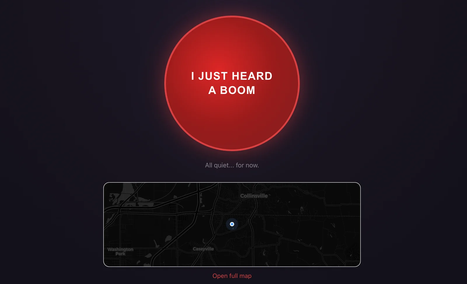
The button is still the button. Everything new lives below it.
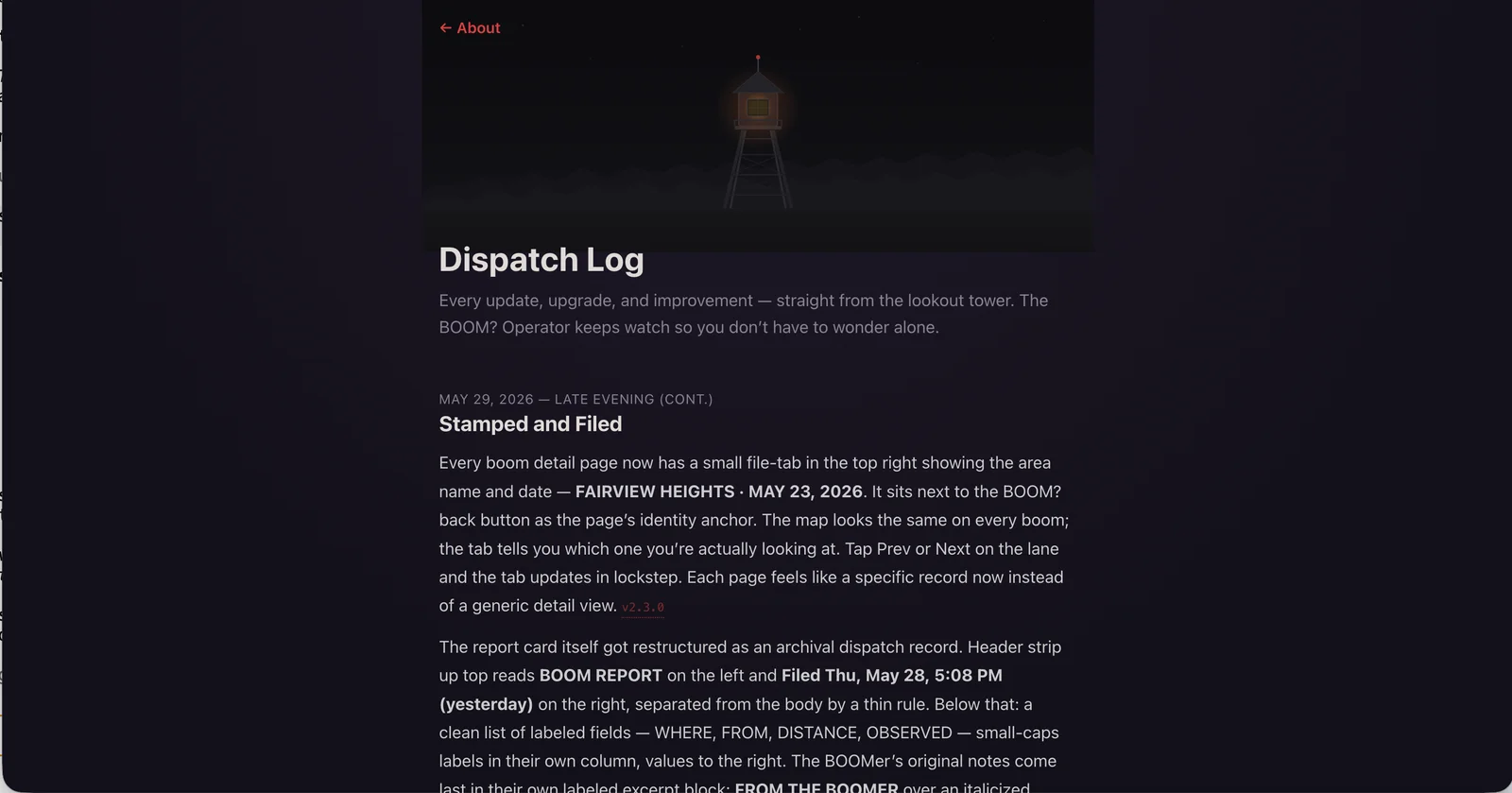
A bunch of smaller things came along too. Every boom detail page now has a file-tab in the top-right showing the area and date. Recent Reports cards light up with a tier-colored glow pointing in the direction the boom came from. And the reactions row got custom icons that finally tie into the tower-and-wire metaphor. More on all of it in the dispatch log.
From the lookout tower.
The wire is on. Anyone in the Metro East is welcome at whattheboom.com, free and anonymous, and you can install it as a PWA if you want it on your home screen.
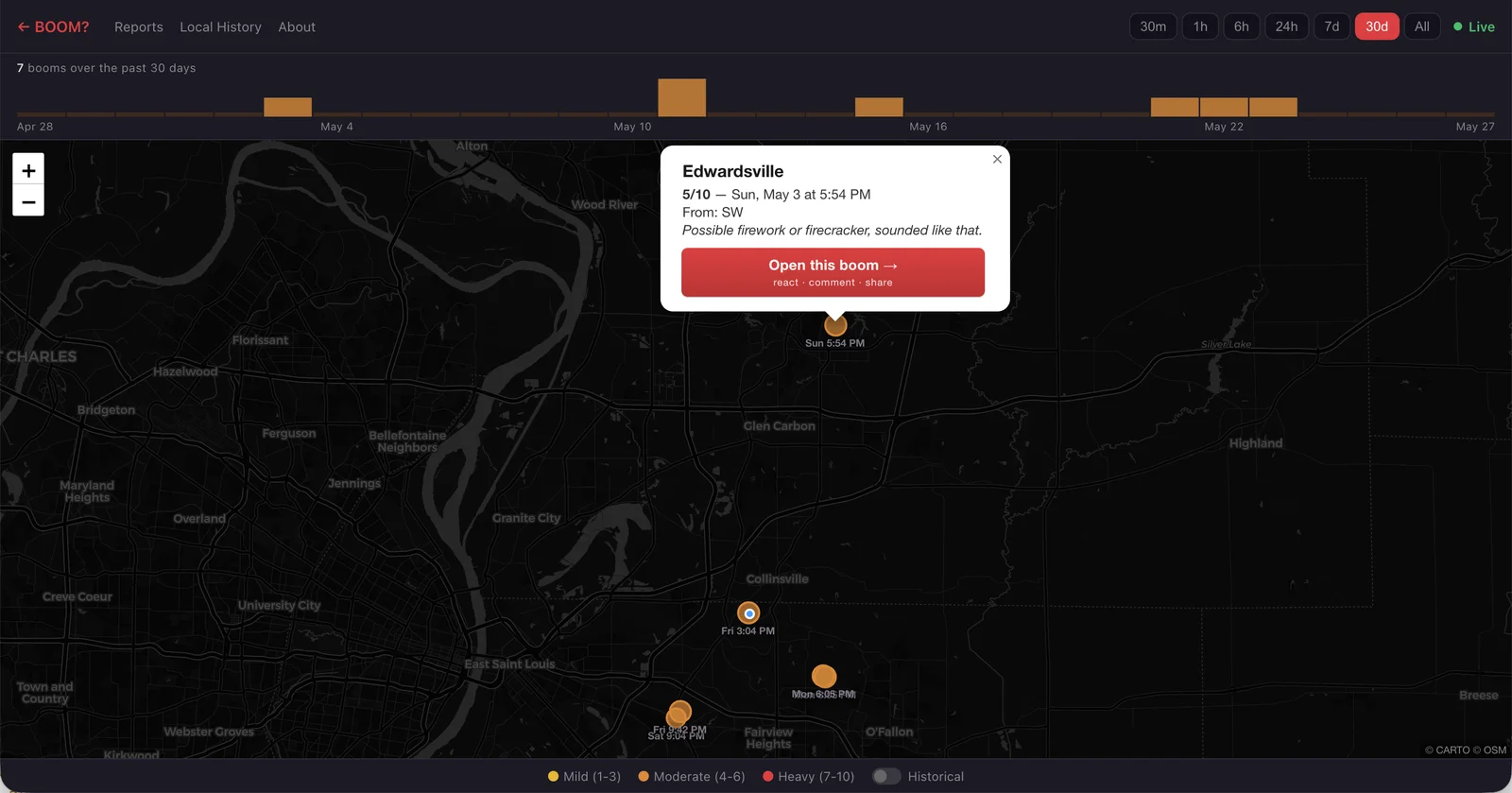
Big update to BOOM? today. The map used to only show the last 24 hours. Now it goes back seven days, thirty days, or the whole year, with a new histogram strip under the filter buttons. Each bar covers an hour, a day, or a week. Click any bar and the map flies to those reports.
On phones the strip turns into a picker wheel. Swipe through time, the bar in the middle stays sharp, the others blur out around it. Like a lens passing over the timeline.
A few smaller things came along for the ride. The home page is now a live radar: booms slide in, the count ticks up, the pin lands on the mini-map without a refresh. The pulsing "you are here" dot follows you to every boom detail page now. And popups on the live map lead with the city.
The map remembers now. Free, anonymous, Metro East. Use it or install the PWA at whattheboom.com.
Haven't posted in a while. Been heads-down building sites and solving problems for some really good people. The kind of busy I was hoping for when I started this. More to share soon.
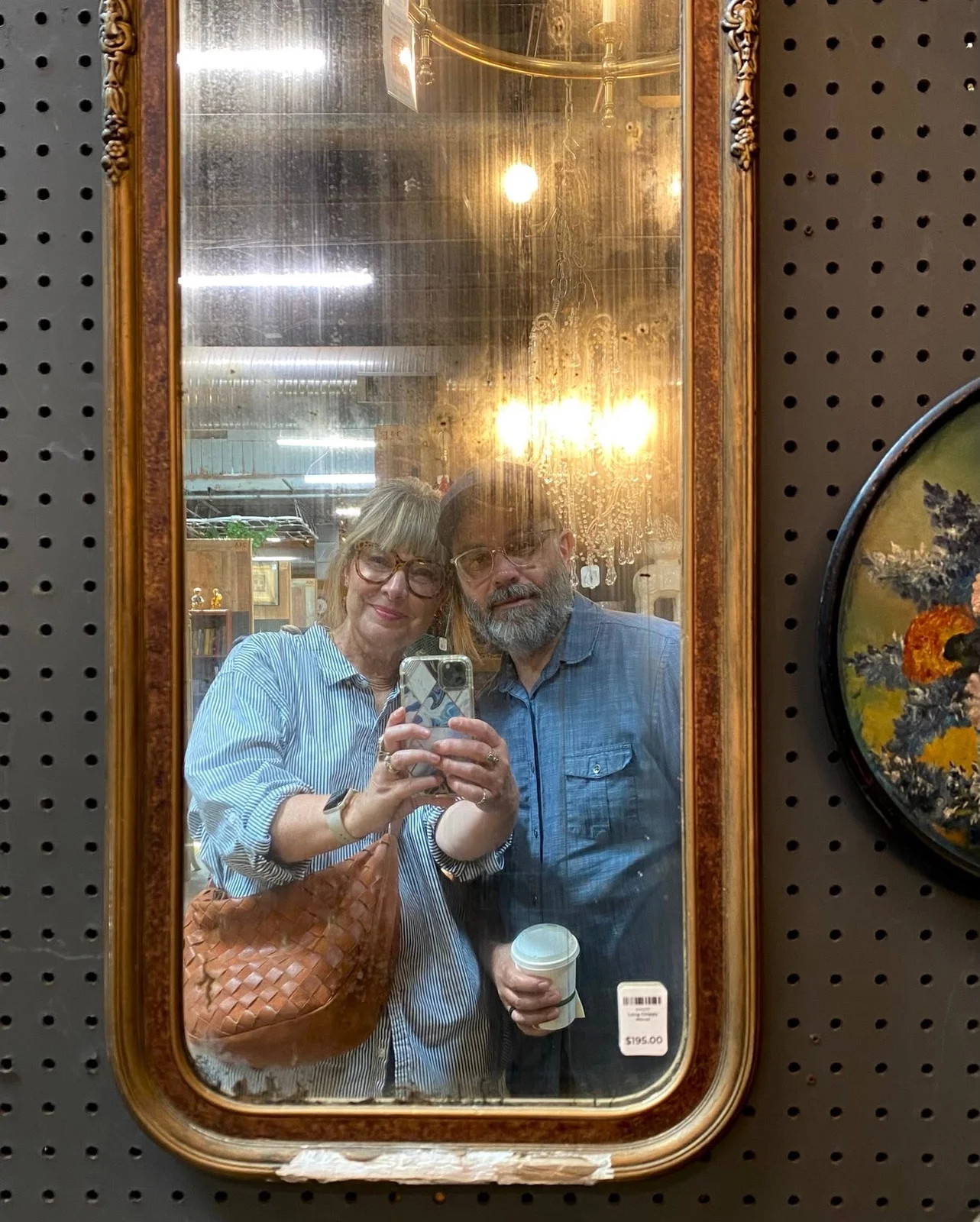
In the meantime, here's my beautiful wife and me on our 28th anniversary date last Saturday.
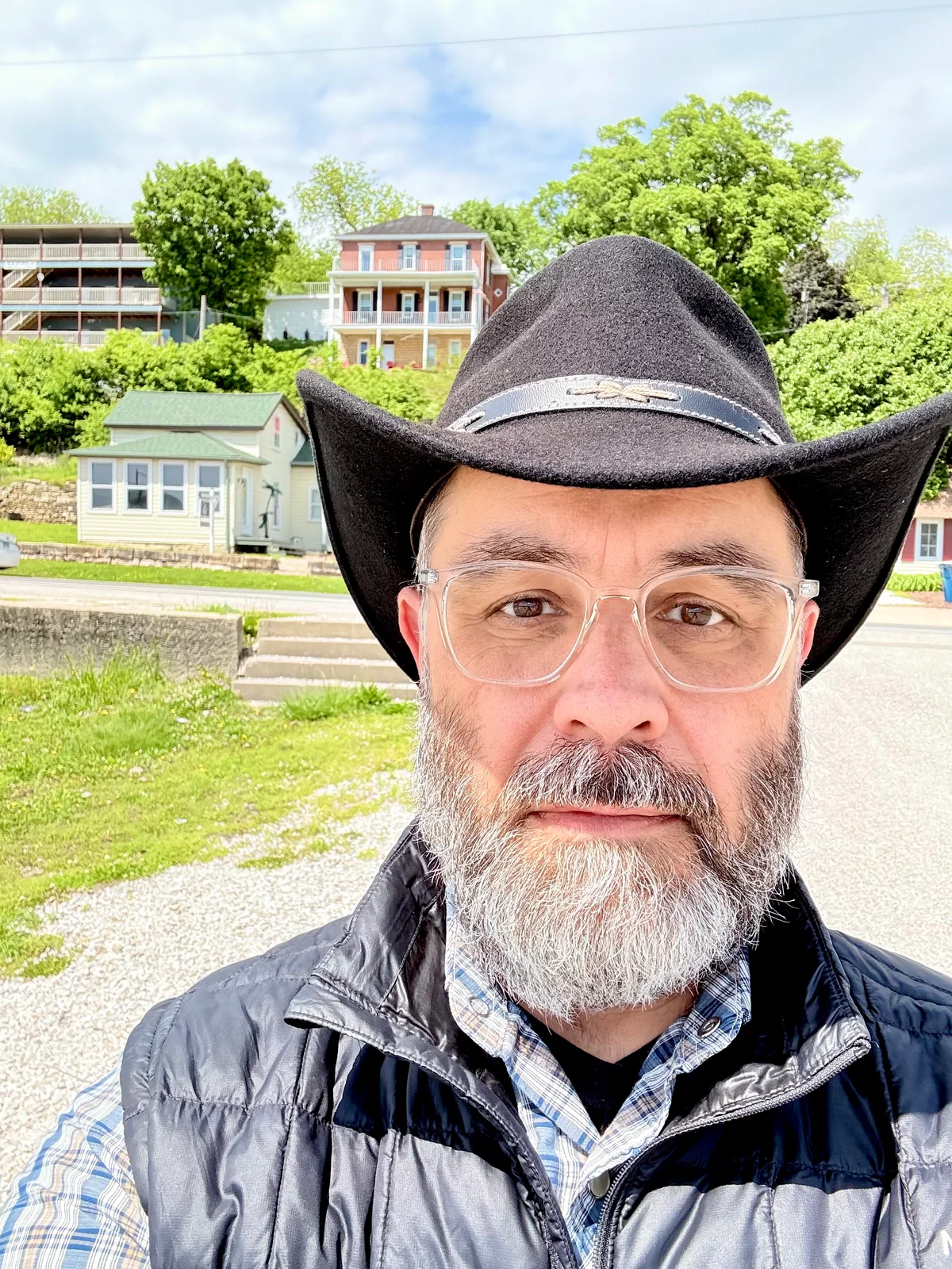
My office looks a lot different since starting Rendered.
The view behind me near Post Commons in Alton, IL one day last week.
I traded a windowless basement with multiple monitors and a full greenscreen studio (cyc wall, 4k cameras, the works) for a MacBook Pro, an iPhone, and my truck.
And honestly? I love it. Between the sunroom at the house, local parks, and spots like Post Commons in Alton near the river bend, I don't struggle for focus or inspiration. Hot coffee, good WiFi, and a calendar that isn’t wall-to-wall meetings. It's amazing how much you can get done when the signal-to-noise ratio shifts in your favor.
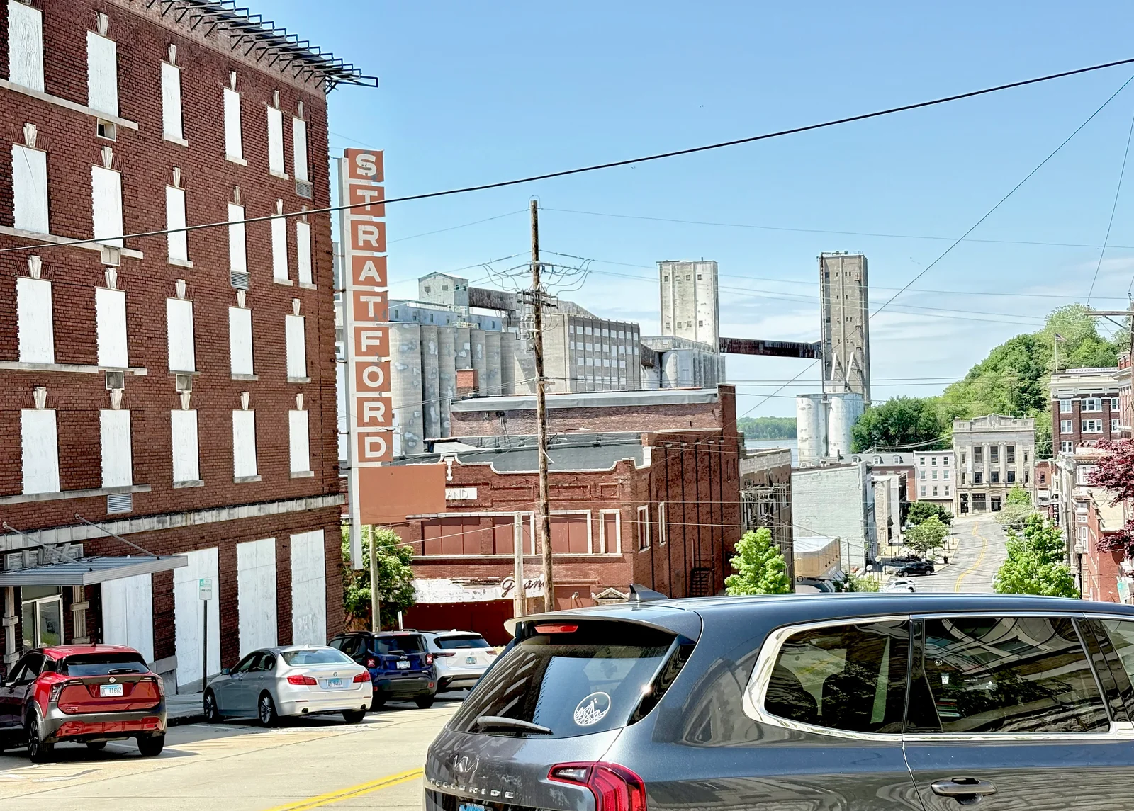
Sure, the hills are steep, but look at the view from my parking spot at Post Commons this past week.
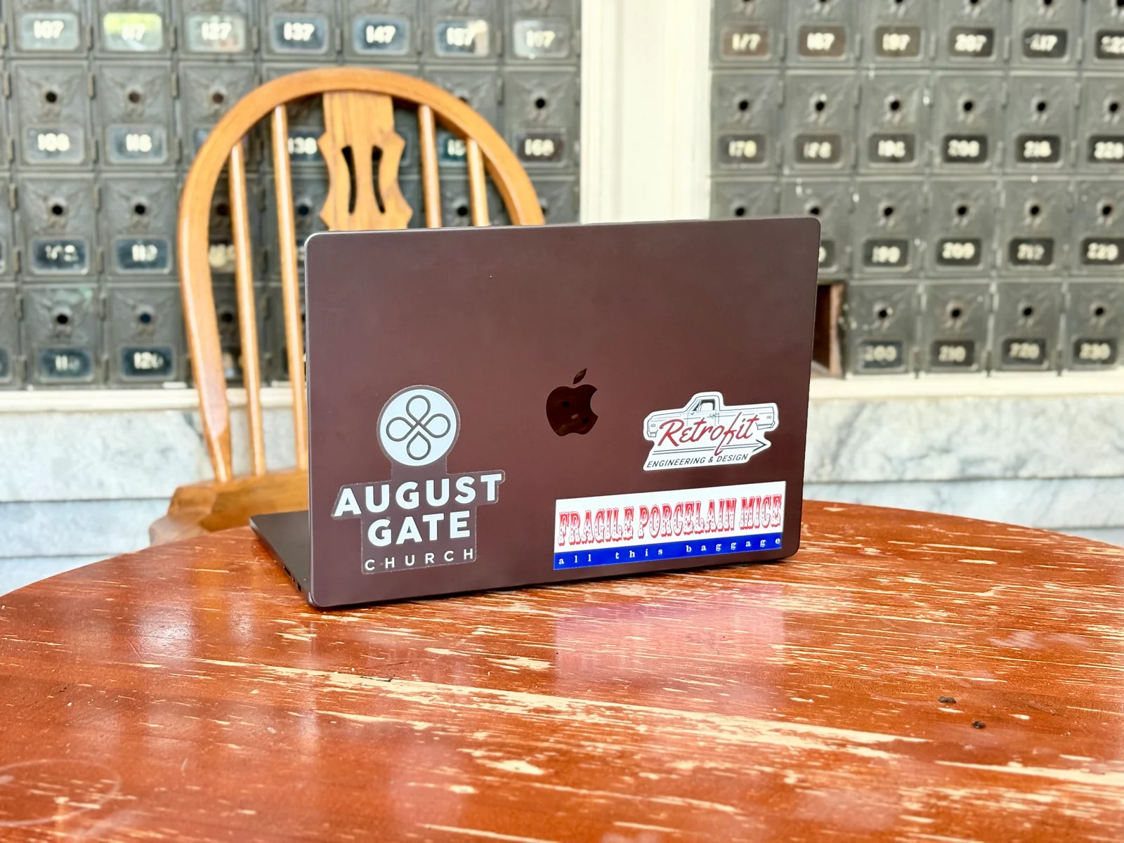
Had to snap a pic of the fresh Retrofit Engineering & Design decal on my laptop at Post Commons and send it to my friend Jesse who owns Retrofit.
And when I get stuck, I drive. Country roads are my muse. Time to take in some beauty, think, pray, and sort things out. Sounds like a waste of time when a hundred things are screaming for my attention, but it's the opposite. It's how I reset.